Monday, 31 August 2009

Graphicus Monthly Challenge - August

Graphicus Challenge - August

August’s Challenge Theme: CHRISTMAS

August’s Colour Scheme: TWO COMPLEMENTARY COLOURS


See the Graphicus Blog for past and present challenges.

So here's 3 cards ....

The first: Christmas Card using Greens & Burgundy. This is a Joy-fold card made in the style of a gift.

Using Papers from the New Decadent Brocade CD which were cut and shaped to the design then I used a fine liner in gold to highlight the pattern. The papers were backed on to a bright green vellum and on to gold mirri board then on to burgundy card stock. Corners stamped with corner Holly flourish from the Christmas Flourish themeplate.

The main tag was stamped using with the matching design to the background which was from one of the Graphicus Guild members stamps. Stamped using Versamark on the burgundy card to create a watermarked effect. Another panel was stamped using the same stamp then embossed in gold. The poinsettias are from the Christmas Fusion themeplate which are stamped on to Acetate then gold leaf has been applied behind. Centre poinsettia is decoupaged. Burgundy glitter to centers.


When you open the card up there is another tag card inside tied with a bow so you can pop in a special message.

Now you can see the embossing and outlining a little better.

Second:

You may have previously met Oliver Twitter .... Well meet his cousin Robin ... no not the ice-skater that was Robin Cousins !!!

Here's Robin ....

Stamps used - All of A Twitter , Christmas Flourish , Seasons Greetings .

He visits every Christmas !


OK now for the third card .... Sunglasses at the ready as this takes Complementary to the extreme. Andy Warhol move over ....

Coming next ... Tall trees .. see you tomorrow !

Tuesday, 14 July 2009

Distress Inks

I'm part way through (75%) writing a HUGE 'How To - Tips & Techniques' with Distress Inks at the moment.
At the Doncaster show I had so many comments on the card below which is one of the projects made by using some of the techniques.


The book pages used are from an old 1949 book about the Publican trade and makes for quite funny reading - lager didn't exist in those days and if you made £3000 a year as a publican you were deemed to be doing very well !!

As soon as I've finished all the pictures and the write up I'll pass the link on to you - but the most important thing with Distress ink is to play and experiment with them.

Relieved yet LIVID

To follow on from one of my earlier posts - re how I just seem to be catching up and fate steps in again .... I don't normally put personal things up on here but this is one time I am also using this as a plea for information.

A week last Thursday I got one of those calls on the mobile .. funny how you know it's going to be bad news before you even answer it !

Hello is that Mrs .... it's West Yorkshire ambulance your daughters been in a car accident do you want to meet us at the hospital ? NO where are you I'm coming NOW .... 5 mins later I'm on the scene .... extremely RELIEVED that my daughter and friend although cut and bruised are in one piece. Even the police were amazed they weren't attending a fatality.

Now comes the LIVID part ... the person that caused this had driven off, despite all the witnesses but with all the carnage - no-one had taken their number plate.


My plea to anyone in the Morley area of West Yorkshire who may just stumble across this post is ... If you have seen a Blue Ford Ka - colour coded bumpers with a damaged front passenger bumber/side please get in touch with myself or the Holbeck Traffic division. This person caused the accident then drove off after seeing my daughters car flip over and didn't stop to consider if they were dead or alive.

Also a huge Thank You to all those who helped the girls, I wish I knew who the lady was who wrapped her towels around their cuts, I will hopefully find you.

Graphicus July Challenge Part Deux

Artylicous will soon have a new CD out ....

Here's a sneak preview of one of the background papers which some of us have been sent out.

I've made two large A5 cards from the one sheet and have used the matching stamps.

The first card is a double styled card based on a half gatefold A5 and a standard A5. The tag on the front made using a brayered resist then over stamped.


Below: The backing paper has been overstamped.


I will add an insert to the card to match the overall colour scheme.


The second card is a more standard A5 card - again using the matching Brocade stamps the background paper has been overstamped and is enhanced by using a Vellum lattice - (courtesy again of Spellbinders) then coloured over gently with the colorbox ink. The front panel was stamped onto a pale greyish card stock and the white in the flowers was re-highlighted with an Inkssentials white pen.


  • Stamps: Elusive Images - Brocade Backgrounds UA4SP0239, Grungy Brocade UA4SP0238, Words of Wisdom UA6GW0193

  • Paper: New Artylicious CD paper. White card 350gsm. Silk Art Card tag. Grey card.

  • Ink: Ranger Adirondack Dye - Pebble, Slate. Colorbox.

  • Accessories: Flowers & Ribbon - Me. Spellbinders Lattice Borderabilities. Inkssential White Pen.

Graphicus July Challenge

Graphicus July Challenge ....

July’s Challenge Theme: INSPIRED BY THE SEA. July’s Colour Scheme: TWO COLOUR HARMONY

I've gone for the second part 'Two Colour Harmony' and using the Green and Yellow and shades of those two colours. This is going to be a scrapbook page but until I take that certain photograph that I know will suit this page I'll leave it as a large 8" x 8" card for now


  • Stamps: Elusive Images - Flora & Fauna UA4SP0151.

  • Paper: Torn page from old book. Graphicus Guild paper pack. Gold Mirri card. Silk Art Card

  • Ink: Ranger Adirondack Dye - Butterscotch, Meadow. Ranger Archival - Olive. Ranger Distress Ink - Peeled Paint, Scattered Straw

  • Accessories: Button & Twine - Me

Yikes where did 2 weeks go ?

There I was just getting on top of things and catching up - ready to begin uploading to here and yet again fate intervenes. More of that in another post tomorrow !

Ok lets get some pictures up ..... Here's Charlie - my sons newest addition and he's gorgeous !

The pink under his nose is actually his lip as he has no fur on it so he always looks like he's poking his tongue out at you !

Ok back to crafting ... Here's a card I made just messing about with some new Nestabilities - the new Lattice Borderbilities.


  • Stamps: Elusive Images - Fleurs et Parfum de Paris. La-Blanche - Flowers & Filigree swirl

  • Paper: K & Co from the Classic Collection, Satin Art Card

  • Ink: Ranger Adirondack Dye - Stream, Ginger, Terracotta, Espresso. Ranger Archival - Russet

  • Accessories: Spellbinders Lattice Borderabilities; Petaloo -Flowers, Ribbon & Gems - Me

Tuesday, 30 June 2009

Pandora's Box

Whoooo hoo I'm back ..... well flying visit sort of !!!

Almost ran out of time to get this submitted for the Graphicus challenge .... Pandora's Box.

The Theme was Exotic and the colour scheme Pink and Orange


Ok let's give you a hint - Pandora's box measures 13" long, 6" high and 5" deep and is made from mount board. ( May I just say boy did it take some cutting !!!)


I just love the top on this and painting the colouring in and doing the shading was pure bliss - yep every single flower & leaf .

'but what's in it ? is it just a box ?' you ask! Ok let's turn it around for you ......


Oooooh so now you see ... let's show you some more then ....


Yep it's to store all those meter long Maya road ribbons that normally just get shoved in a box. I need to punch some more holes though as I've more ribbon than I realised !!!!

Back tomorrow with some more things for you x because tonight ( it's now 11.24pm ) and I have a 20th wedding anniversary card to make for my darling husband x


Monday, 16 March 2009

Ink Racks / Craft Racks Part II

Thank you to everyone who has emailed me - I'm so overwhelmed by the response - we must all need a lot of organising !!


Here's a quickie web page for them CLICK HERE with all the sizes, prices etc.

Here's a few more photos of just how much you can store on these ...

Double Ink Rack

Above:

Picture shows a large A3 storage box of various ink pads. Even if you stack your ink pads by type you still have to rummage to find the colour you want ! or do you empty the whole box on to your craft table ?

Why not pop them on an Ink Pad rack ? Everything in the box is now on a Double size rack - not all have been double stacked so there is still room for more. Plus there is space to put re-inkers and don't forget you can store more items on the top or why not display your craft work !

Triple Ink Rack

Above:

Pictures shows a typical craft table, with storage boxes full of embossing powders, glimmer mists and ink pads - not much room left to work ! Why not pop it all on an Ink Pad rack ? Everything in the boxes is now on a Triple size rack - not all have been double stacked and there are still some empty shelves - so there is still room for more. Plus there is space to put re-inkers and look you can store more items on the top or why not display your craft work !

Below:

Now see how much table room you have to craft on! Everything is fingertip ready to use. Or why not Wall mount it for even more table space !

Look How Much Space on the Table !!!!

Look How Much Space on the Table !!!!

To answer a few questions that have been asked :

Can I collect ? yes you are more than welcome to collect, we have workshops & a furniture showroom based in Batley, West Yorkshire.

Do they come ready assembled ? - Yes everything is fully assembled - just unwrap and start emptying those boxes !.

Are they heavy ? Weights etc are given on the link above.
For wall mounting we also include fixings. As wall types vary so much you will need to use wall plugs and screws that will be suitable for your wall type.

I have an awkward space - can you make a custom size ? Yes - just email me.

How do I label my ink pads ? - We include self adhesive labels that are just the right size - use your ink pad to colour them and stick them on the side of the ink pad - most ink pads have a space for this.

Do you make one with a ribbon spool ? - YES - Coming soon !

Keep an eye out on my Blog as throughout the process of designing these racks - we made several styles until we came up with the optimum style and sizing - so I have a couple that were draft design models in the single size.

You will be able to win one of these draft models !

Friday, 13 March 2009

Ink Racks / Craft Racks are here ...........

Well I have nattered my other half to the bone - poor lad must be sick of me and ink pads by now and I think I am officially banned from our workshops as I seem to have put their normal production schedule in backwards motion !

These are what the ink pad racks are going to be like and for the small size of them ( only 8cm deep so won't clog anyones desk up or they can be hung on the wall ) - they will hold loads !!! Each single shelf will hold either 4 full sized ink pads double stacked, 6 distress ink pads double stacked, Adirondacks 4 full sized ink pads double stacked, yes even when the ink pads are double stacked you can slide each one out with ease .... I think the pictures will show just how much you can fit on these and not just for ink pads as the shelves are removable so other items can be stored. I've even sourced the right sized labels for inking and popping on the ink pads for ID.


Single: 12 shelves

Will hold a minimum of 48 ink pads - plus space for re-inkers / pens etc
Width 31cm , H 56cm , D 8cm


Double: 24 shelves


Will hold a minimum of 96 ink pads - plus space for re-inkers / pens etc
Width 56cm , H 56cm , D 8cm


Triple: 36 shelves


Will hold a minimum of 144 ink pads - plus space for re-inkers / pens etc
Width 81cm , H 56cm , D 8cm


So if anyones interested just let me know as they are going to be on sale shortly.

Tuesday, 10 March 2009

Graphicus Challenge - March - ' Yellow & Sing '

Just a couple of cards to go with the Graphicus blog challenge:

All the items used except for card stock are from Graphicus:

The first is using the ' Good Deeds ' themeplate. The background is Glimmer misted in Honey Dew and Lemon Zest from the ' Spring Fever ' set and over stamped with one of the Good Deeds stamps and a flourish stamp. The ' Tag ' is flourish embossed and glimmer misted and rubbed to deepen the effect and a couple of organza ribbons. On the front of the tag is two 2" stamped , coloured and etched ' Stampboard ' pieces. On the right the matching verse and stamp from the Good Deeds set.


The card is an A5 - ¾ fold card which just adds a little more interest than a standard gatefold. Again the back ground is coloured and stamped as above.


This next one is just another pretty card which I made as I had some card left over with the over-sprayed glimmer mist so thought why not make a quickie card .....

This one uses the Fuchsia Themeplate for the main panel and also the small fern style leaves from the Hyacinth Themeplate and the Lily Themeplate . The stamping was inked with Memento and Versafine inks, the buttercup flowerheads were highlighted with 0200 Sun Yellow Inktense Pencil. Inktense Pencils .

I do have another in the making that will tie in more with the " Sing " part of the theme ... all will be revealed shortly !

Friday, 27 February 2009

Coming to a Store near you soon !!

I kid you not ... Ink pad racks ...

This is just a demo model, the rest will be available soon in 12, 24, 36, 48 - all the way up to 100+ versions , they will be in horizontal and vertical versions and can be desk or wall mounted.

In the meantime I'm gonna paint and decorate this one ...

Thursday, 19 February 2009

Vintage Rose & Tag for Moira

Just a couple of quickies ...

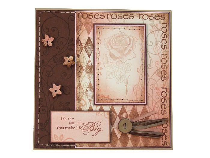
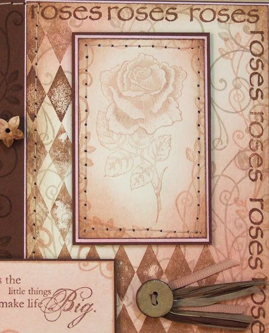
First Vintage Rose .... Warm Pinks toned with chocolate ...... reminds me of Hot chocolate with pink marshmallows !!! oh how my mind works or am I hungry ???


ABOVE:

Background: The main background was made using a ivory cardstock. Using Anna Griffin Ink pads - Cream and Shell - the flourish from the 'Graphicus Guild' members stamp pack ( month to follow ) was randomly used to create the flourish back ground.
Over this I used one of the Anna Griffin single row Harlequin stamps in her Chocolate ink colour - after inking the stamp I first did a pre stamp on a rough piece of paper to give the real stamped image some distress to it.

The 'Roses' word is from Elusive images 'Rose Stem Script' . Using my Ink dusters I randomly dusted some Shell ink and also some Memento Angel Pink, the edges were dusted with the Chocolate . The background then matted on to some pink card stock and then on to a larger
chocolate cardstock with the same 'Guild' flourish stamped over the cardstock in the Chocolate ( Tone on Tone ). On the left I added some stitching detail and also some wooden floral buttons - coloured to match - to add some dimension. On the right a larger button with some grossgrain ribbon (coloured with the Shell ink pad ) and some Rafia.

The sentiment is from Stampin-Up - in the Chocolate ink, again dusted over with the Memento and Shell ink and matted on to chocolate card stock.


ABOVE:

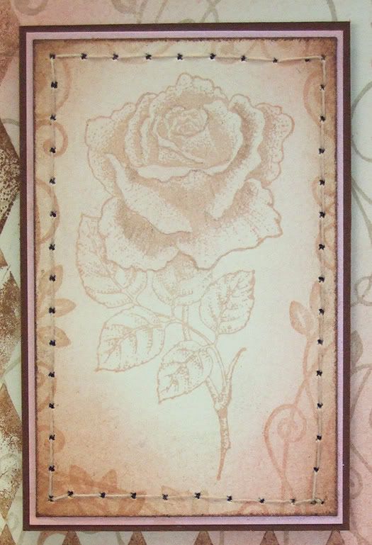
Rose Topper: The Rose is from Elusive Images new themeplate 'Harlequin Rose' and was stamped in the Shell ink. I used a matching colour pencil to add a little extra depth to the shading of the petals. The edges were dusted with Shell ink and also some of the Chocolate Ink, matted on to some pink then chocolate card stock. Again this was sewn around for extra effect.


ABOVE:

Bit closer detail of the card.


Now on to Moiras' Tag

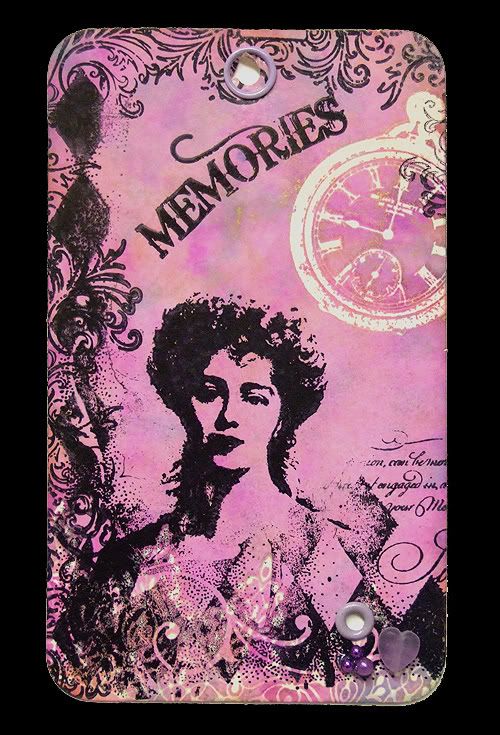
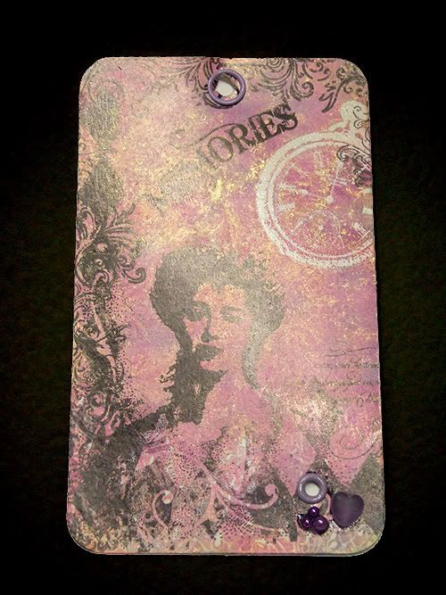
MOIRAS TAG: I just love those Alcohol Inks but big problem is when they come out I spend hours just creating Tags !!! This one below was just one of those that evolved as I was making it, no set plan.
I decided to send it to Moira - ( hope you don't see this before you get it ! ) but I'm sure that she'll agree that these pictures don't do it justice !


Please don't ask which colours I used as I just grab a few I think might work together and off I go. What I can tell you is what I did and what stamps were used:

Firstly I used the stamps as a clear resist with clear embossing powder - ( my preference when using Alcohol inks with resist ) - the watch is from Elusive images - 'Scripts and Timepieces' themeplate, the lower resist is from Elusive Images - ' Damask Squares ' themeplate. After applying the alcohol inks I then ironed off the clear embossing powder.

Using an Archival black inkpad I inked just the edging of the main rose stamp from the Elusive Images new themeplate 'Harlequin Rose' , now using a flourish from the 7 Gypsies NottingHillset I stamped around some of the edges. The Memories stamp is from the same set and even though it is supposed to be straight - the great thing with clear stamps is they are flexible enough to arch them !

The lady is from one of Joanna Sheens plates which were in her sale but I haven't seen them on again. In the lower corner I just added a few beads and an eyelet, at the top a gromet ready for a ribbon.

BELOW:

Just to show the shimmer of the mixatives - you really need to see this effect for real as it just can't be seen right on photographs.


It's in the post to you Moira x

Wednesday, 18 February 2009

I'm Back .....

Well what a whirlwind since the New Year ... By the way if I haven't had chance to say it to you ... Happy New Year !!!

OK so what's been happening ???

Well Egypt was unbelievable .... just a few pics below to show some of the AMAZING sea life and scenery ... now I have been good and only put a few of my favourites on here but to be honest there is so many I'm going to have to do a separate blog for the bulk of my photos.

Upon returning from Egypt on the 25th we were then given 5 days notice that our house move was being brought forward from mid Feb to the 30th Jan .. so a mad rush then ensued to pack everything we have accumulated over 17 years in our beloved home. Lots of boxes still to unpack and a new dedicated craft room to design and I may then be back to a bit of normality !

I've alot happening during 2009 ... I'm so excited about it but more about that when the time is ready !

In the pics below you'll notice I took my copy of Craft Stamper with me, I was very good as I got it the day before we flew out and even though I was severely tempted to peek through it, I quickly packed it at the bottom of my suitcase. Whenever I wasn't diving you'd find me on the sun lounger reading avidly ! Hey I wonder if we could start a 'Where do you read yours ?'

Anyhow on to some of my photos of Egypt and the Red sea ..... If you find you are missing any pictures then try refreshing the page ( my server seems a tad slow tonight ! )

Below: Take one stunning region - Sinai Mountains, Sharm El Sheikh, Red Sea


Below: Sinai Mountains

Below: Add one Beach by Day


Below: Or by Dusk


Below: Or by Night


Below: Add a Craft Stamper magazine

And you have a perfect fantastic holiday .... but to make this a colourful holiday we need these .........

Now if these don't get those creative juices flowing ..........


Below: Giant Clams - these are almost 50cm wide each one


Below: Free Diving - Yet unidentified rare male species ... Ok it's my other half !


Below: Even the flora didn't go unnoticed .....


Well as they say in the cartoons ... That's all folks ....


Only for now .... back soon xxxx