Friday 31 October 2008

It's official ...

Now when you see pictures like this ....

And this .....


It can mean only one thing ............. I'm off diving again !
(well in 4 weeks time )
This time to Egypt and the Red Sea, so the underwater camera is having it's O-ring overhaul, the diving gear is all coming out of the cupboard, having it's full inspection and testing.
My other half was so overwhelmed with excitment - he went to bed !
Oooh I feel like a kid at Christmas - can't wait !

Tuesday 28 October 2008

Chocolate Resist .........

Mmmmmmmmm must have been what I was thinking when I made this .............


Ok lets start ... This is a great and easy way to do a resist stamping technique and really quick for one of those last minute cards. All in this only took about 25 mins to make.

Main card in a mottled natural cream is an A4 scored and folded to make an A5 landscape card. Main matting layer is the tobbaco brown that I seem to use alot of.

The top layer is the mottled natural cream card which has the resist stamping as the main feature with an overhanging tag with a word phrase and some Grossgrain ribbon.


So lets start - everything apart from my basic card stock is yet again from Graphicus.

I used the cow parsley stamp from the "Wild Meadow" themeplate and the Fine detail embossing powder in white as I want this to stand out from the cream and also to soften the shadow effect.
So after embossing all the flowers I used a brown pigment ink pad to stamp the same images over the white embossed images - now you need a pigment ink pad as when it comes to the Glimmer misting you want this ink to slightly run to give a softer shadow. Don't worry if your colour is covering the white as in the next step this will be misted away !
So with the Crème de Cocoa Glimmer Mist just spritz away, any ink that remains over the embossed flowers can be gently rubbed with either a soft paint brush or cloth.
The white cow parsley heads were filled in with an Inkssentials White Pen to highlight them more and the edges were inked with the brown ink pad to give them some more depth.
The brown Grossgrain ribbon was in the sale items at the Graphicus open day - and anyone in the Graphicus Guild - read your monthly newsletter as there are ribbons in there at a knowdown price !

Below: The topper is one of the large Tags - simply folded over and the corners rounded, quick spritz of Glimmer Mists and the edges inked . The quote was a stamp made by myself .


I'm going to try this in a few other colourways as I think it could look fab in greens or russet reds.

Sunday 26 October 2008

Peacocks ....

I often browse through the Galleries at Graphicus, there is some extremely talented people on there. I was taken aback by with a card made by Lesley Wharton - "Lesleys' Card" . Now it was my dear old friends birthday in September and I had began a card based on Lesleys' idea but the present I made was one of those - wow I've got to get one of those moments while at the Graphicus open day. So below is what I did .....


Now this is a big card, I used a lot of my scrap booking card stock for it and I think off-hand it ended up at about 10" square. The idea of the card is that it opens in an alternating fashion, so after opening the initial front covers left then right, the pages inside then open to the left, then to the right until the verse at the end is reached.


So what did I do ... The initial "Peacocks" from the "Peacock Ladies" themeplate were stamped in
"Versafine Lagoon Blue" and embossed in clear. I picked 3 vibrant "Glimmer mists" colours - Fully Purple, Patina and Yellow Daisy and spritzed each colour separately, waiting for them to dry before add another colour - this is because I wanted the brightness of each colour to show - if you spray them over each other whilst each is still wet then you can end up with a murky colour. When everything was dry I touched up the eye of each feather with a gold pen - this took flipping ages ! Behind the outer leaves I used some Patina Glimmer mists on some parchment paper to back them with which gives a lovely effect as the glimmer really shines on this.


Below: So after opening the outer layers this is the next layer. The background card was colour washed with the Glimmer mists, then the Peacock stamped and embossed in Gold detail powder, then
over painted using the Glimmer mists to deepen each ones colour. This section then opens to the left to reveal the next layer.


Below: The backs of any previous upper layers have been Ink dusted over so as not to leave them as plain white card. The Peacock lady from the same themeplate above was stamped in Versafine Onyx black, then using the glimmer mists as paints I just coloured her in, a few touches with the gold pen to add to the effect. This page now opens to the right.


Below: The final page with the greeting . The design is from the "Peacock Summer Party" CD and the verse was created on n overlay for the insert. Again the back of the previous upper card have been Ink dusted.


Now the present ....

At the Graphicus open day they had these brilliant Maya Road chipboard boxes which have a small book inside.

I first gesso'd the whole thing - box and all the pages ( every side ! ) Then glimmer misted the outer box before using various stamps from the "Peacock Ladies" themeplate all in a gold fine detail embossing powder.


Each one was coloured in using various glimmer mists as paints and some added sparkle in the way of gems.


Each of the pages was ink dusted and then on the front side either had a stamped image or sentiment on.


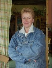
The reverse of each page had photographs on which are very special to Viv, I converted the photos to black and white and added some white edging detailing to them. A small vellum wrap with the date on written with a gold pen.


And I left two blank pages at the back so she can add a couple more in time x


Wednesday 22 October 2008

Free To Good Home ........

One dose of flu ! ( or severe cold ) ..... Maturing nicely but would prefer a different host.
I'll even chuck in the aches and pains for nothing !

Time for the beechams Hot lemon x


Monday 20 October 2008

Duck Egg Blue & Sepia

A few things have been used on this card, so lets start at the beginning with the main coloured card.


The main card was firstly run through my printer so I could print the background text. Over top I used a "Glimmer Screen" and sprayed "Patina and Creme De Cocoa - Glimmer Mists" over the top. The glimmer mist will slightly make the printed text run but this is what adds to the aged effect.

The stamping down the left side is from the "Filigree Fusion" themeplate and stamped in the Versafine sepia. A bit of dusting around the Edges with my Ink dusters. The flourishes on the right are from some Stampin Up stamps I've had for ages.


The tag was first embossed on the left side with a flourish, then using a few odd ink pads Ink dusted in the Sepia and duck egg blue, highlighting some of the embossing. The left hand then stamped using one of my favourite theme plates "Fleurs et Parfum de Paris" . The right hand stamp is again from the "Filigree Fusion" themeplate with some gem stones. A bit of grossgrain ribbon - slightly inked over to finish the tag off.

The flower is one of my bargain flowers - (which I must put a post up about these) - held in place C/o Crocodile large brad. The whole top was then matted on to some Tobacco brown card, then on to some duck egg blue card and finally on to the main card.


If anyone wants the old style Text to print out yourself on to your own card - just give me a shout and I'l email it over x

Inspiration from Nature

A couple of pictures of my favourite trees & plants in my garden at this time of year.


The first is what is called a "Stag's Horn Sumach Tree" , and the colours are absolutely stunning.


During the beginning of the year the tree is totally bare and just resembles stag horns with a velvety texture, during Summer it is a luscious green, but it's true glory emerges during Autumn, as the leaves change to a deep carmine red, then through to a blazing crimson, then the oranges come, persimmon, amber, then finally through to the yellows. The yellows don't last long as that is the final colour change before they fall and then the cycle begins again.


Another of my favourites is this Jasmin, I had it for years and the flowers have the most irresistible scent during Summer.


Isn't nature wonderful x

Summer Evening

This was a square card I did a while ago using the "Wild Owl" themeplate.


The card was done on watercolour paper and I used my Ink dusters with just regular ink pads to create the background scene and a fine line watercolour brush using Versafine smokey grey for the faint line clouds. The shadow tree from the "Orchard" themeplate was lightly stamped in Versafine smokey grey and the foreground grasses are from the "Wild Meadow" themeplate just stamped in various green inks. A torn paper strip, again coloured using my Ink dusters and then a gold embossed phrase from the "Words of Wisdom" themeplate and finally attached with brads.

The swallow was stamped with a Brilliance black ink, and the flourish bird was stamped on to an off cut from the background the cut out and placed on the torn strip to make it seem as though it was perching ( Not sure if that is a real word ! ) . Everything was then mounted onto a gold layer, and then on to a black card.

Saturday 11 October 2008

FREEBIES .... New Papers.

Freebies again ! Enjoy !


Just a small sample of some of the new range of coordinating papers I'm working on, although they will be in about 10 colour ways and 6 designs, I've popped 3 of the Orangey/Pink/Red themed ones on for you to download. I've just done them in a top print quality A5 jpg format for now and if you use a graphic program you can reduce the size to A6 if you wish or just cut what you need from the A5.


The papers are in their own Zip file and you can download one or all. As my server space is not cheap - please just email me for the password to unzip the files.


The downloads are quite big approx 3Mb to 5Mb but if you're on broadband this won't take long. To download click on the picture and a new window will open (if you have a pop up blocker you may need to allow the download window to open). You will need to select "Save" which will start the download, and you can choose where you would like to save it on your PC ( I'd recommend your desktop ) . Double click the file and enter the password to open it.


SHEET 1


SHEET 2


SHEET 3

Monotone .....

I was commissioned to make a card for a lady whom I was recommended to her . She had searched everywhere for what she had in mind but couldn't find what she wanted. ( I'm sure we've all been there before ) All she gave me was it must be black and white, ornate and a verse for her mother.

Now Black and white is not always as easy as it seems - blacks do vary in colour so choose a black inkpad and stay with it through out the project ! My choice was a Versafine Black Onyx.

This is what I made : A 9" x 9" gate fold card.


No those aren't backing papers - both panels have been 100% stamped, the left with black on white hammered card and the right panel with white on black hammered card, each matted on to some satin silver card then matted on to the main card.

Eyelets C/o crocodile with an organza black ribbon. The Lady is from the "Graceful Ladies"
themeplate which is the framed over with a matted picture panel stamp with diamante gems -but they don't photograph too well. ( My new circle cutter really came in handy there for that aperture! ). The happy birthday is several layers matted up ranging between black, silver, white and the topper. The Happy birthday stamp is from Serendipity and one of my all time favourites.

Below: After opening the card there is a vellum overlay over the main insert, this has been embossed with the "Holographic Embossing" powder ( I've tilted the card to the light to show it a bit better ) which I'm not sure if it's still on the Graphicus site but if not then Joanna Sheens' site normally has it. I know many people have tried this holographic powder and can't seem to get the hang of it but the trick is not to overheat it - if you do it just goes a gooey creamy colour. There is something in the powder which reacts to the heat - this is how I vary the resulting colours as I keep my heat gun on a low setting and keep it moving.


Below: The main insert behind the vellum has the "Rose Stem" and the greeting. The Rose stem has been stamped in Versafine Onyx black and then using a pencil shaded in an a touch of glitter on the petals, matted on to some black hammered card and edges torn.

The verse is quite sentimental.


Below: No way did I have an envelope for this card ... so out to my scrapbook heavy card stock to make a box for it ! The top panel was stamped and the I masked the corners to mitre the stamp, some more black organza ribbon and then stuck this to the box lid. The box base is in black with some tissue wrapping for the card.


The lady who commissioned this from me was very very happy to say the least !


For me - I just love making them !

Wow They say things come in 3's ... 4's ... 5's ???

Apologies to all ........... Yes things do come in threes but over the last four weeks everything and anything has happened.

Blogs aren't really the place for me to blab on but in short ...
I've been quite poorly.
2 marriage break-ups within our close family ( not my marriage I might add ! )
Daughter in a car accident.
Roof on house in France had severe leak and damaged part of an interior
roof.
Full in depth fire inspection at the shop due 23rd Oct ( so all those little
things that we need to get sorted must be done ! )
Need I mention the economy aswell ?
I'm sure there's more as it certainly feels like there has been !


Thank goodness I can escape a bit from reality with some good ole crafting !
My BIG project with the Unicorns is still underway but had to be put on hold whilst dealing with the above - my poor husband seems to think I'm getting carried away with it ! Watch this space.


Anyhow here's a couple of other cards I did a few weeks ago with the Unicorn stamps.


The "Dream It Do It" is embossed on vellum with the Holographic embossing powder which gives a great iridescent colour. The outer edges of the main picture have been edged with some gold mica - but alas this doesn't photograph too well. I've tried tilting the card in the pic below to try and show it more clearly.


The next Unicorn was done using a piece of gloss photographic paper 6" x 4" and memento dye inks for the background.


Then using Brilliance black and also Ancient page black the tress, Unicorn and foliage were stamped.


The picture panel has been mounted on a black card and then has an upper frame which stands proud of the picture panel.


The card isn't finished as there will be an outer acetate jacket ( shown below the in-progress picture ) which hopefully when it's completed will be like an enchanted forest, when you open the panels - go through the trees - it will then reveal the picture above. I've still to finish the foliage and do some glittering on the back of the acetate.


The picture below was made on a off-cream card stock and apart from the stamped Unicorn and tree skeletons was painted with just plain black ink - again this is in progress as it was my starting block for the ideas above.