Now I'm back in the office I'll start again !
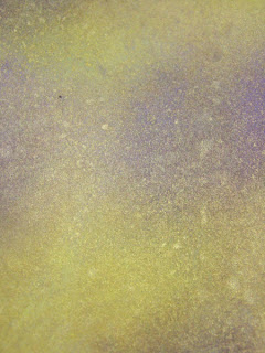
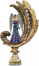
Below is a card I'm making for a friend, the background was colour washed over with the Tinkerbella Ink in the Rich Violet colour, then randomly stamped using the filigree swirls from the Damask Hearts themeplate, ( now if you enlarge the picture those eagle eyed amongst you will also notice the smaller versions of these - they were in the December Guilds members offer stamps ) in a deeper violet. The background for both toppers was made with the Glimmer Mists - Pink Bubblegum and also an odd splodge of the Rich Violet. Again I normally do a whole A4 sheet then I can choose what bits I want to use - the spare gets popped in my backing box.
The top left is from the Delightful Damask themeplate, the bottom from the Damask Hearts and the edging around the bottom one was also from the Decembers Guild offer. I purposely didn't want a full on black , more of a worn effect , so after inking up the stamp I gently prestamped on a spare piece of card just to take some excess ink off. I haven't finished the card as I just wanted to show you the effect of making your own backings, the top right image is a piece of Stampbord , coloured using the glimmer mists to match, overstamped with a green then stamped again with the mini Filigree and a little scratching to highlight areas, I still have a couple more to do to finish the card.
Ok so scroll down to see the great backing papers that I started this about ............. Please remember you can click on any of the pictures to enlarge them.

Making your own backgrounds is so much fun, I could spend hours doing this, I tend to sit and play around with my colours. All the backgrounds below were made using the Glimmer Mists Spring Fever set and Tinkerbella inks. I've tried where possible to show alternative views as the colours will change as you move the papers around. All my papers are either A4 or A5 size. As a note - although I call them papers most of my backings are done on card around 200gsm.
Glimmer Mists - Lemon Zest and Rum Raisin, with a final spritz of Irridescent gold.

Below .... Glimmer Mists - Denim Blue and Honey Dew Mist and a splash of Irridescent Gold. This particular backing is to be used with my Peacock stamps from Graphicus


Below .... Glimmer Mists - Denim Blue, Irridscent Gold and Tinkerbella Inks Sky Blue & Teal


This A5 below was what was made from the excess ink and overspray from the above paper, the texture comes from the corrugated board that was below the paper.
This next one is so easy to make , and gives an A4 sheet full of wonderful colour. Just fold an A4 sheet in half, blot - splodge - splatter whatever colours you like on one half and simply fold the card over and rub to mirror the image on the other side, touch up any places as required. Glimmer Mists used - Golden Terracotta and Lemon Zest with a little spray of rum raisin around the edges.
Glimmer Mists - Pink Bubblegum and Rum raisin - just using a spray and holding and turning the card to let it flow naturally.

Now the next couple are for some cards I'm making for a friend, and yes the colour really is a Lime Greeny Yellow ! Using Glimmer Mists - Lemon Zest and also some Tinkerbella Ink Sunshine Glow kit. As this is part for a project I've already stamped one section in white and clear embossed it before making the background. Middle section has had some of the leaves touched in - using the Tinkerbella ink. As mentioned - the colours change so beautifully as you turn the page around. The lower picture was made the same way but with a few strokes of Tinkerbella Teal.


These are for the same lady - to go with the above , this time the papers were made with the Tinkerbella inks , the Rich Violet and the Teal ( mixed with some Glimmer Mist Pearl Glimmer ) I have made the A4 sheet sectional as I'm going to be using it in various ways. The top section is a nice grungy texture - criss crossy brush strokes blending into a soft Turquoise. The next sections are much deeper as some of them will be overlayed with a vellum as shown in the pictures which will soften the colour back down.

Ok - back to my favorite colours - I just love these rich warm Russet tones - all again made with the Glimmer Mists and Inks

Well that's just a few of my backings - I hope I've managed to show just what wonderful effects can be gained from just a few simple items and it really doesn't take long.
Tuesday 26 February 2008
Backgrounds using Glimmer Mists and Inks
Posted by
Deby
at
16:46
7
comments
![]()
![]()
Labels: Glimmer Mists, Graphicus, Stampbord
Busy - Busy - Busy
Apologies to all, work has been so hetic and my blog has taken a nosedive of late, but in the snippets of time that I can catch I have been making lots of backing papers and card , so I'll be popping them on for you all to see.
Making your own backing papers I just find so relaxing, I never know what's going to turn out and every one is unique, I'm sure quite a few of them refect my aurora. Anyhow pictures speak louder than words so I'll pop some pictures on.
P.S. I haven't forgotten the Queen of Hearts but I'm doing a lot of detail painting on that as and when I can - all I will say is The Luttrell Psalter
Posted by
Deby
at
00:22
0
comments
![]()
![]()
Saturday 9 February 2008
Knave of Hearts
Wow - I saw this in the Graphicus Sale - Knave of Hearts and at half price ! I wasn't too sure what I might use it for but at £6.25 you can't go wrong. Boy was I wrong - ( gob smacked as they say in Yorkshire ) the detail in this set of stamps is fantastic and I hope the pictures go someway to showing this.
My first reaction that sprang to mind was the old Medieval architecture, the colours of the stonework and etchings as often seen in these old places and I've tried to bring this out in the card.
1. Using direct to paper techiniques I created an old stone effect background, over the top of this I stamped the large acanthus styled design in a deeper shade, then over this in various shades used in the DTP I randomly stamped the crown.
2. The border edging on the left and bottom of the card was stamped using a sage green with an odd hint of holly green. The emblem in the bottom corner was a flourish stamp which was then embossed in copper to resemble a seal ( no - not the ones that live in water ! ). I'll explain about the top right emblem lower down.
3. The scroll was made by taking some paper and aging it using Vandyke crystals dissolved in distilled water and used in a spray bottle. You can add more or less water dependant on the depth of stain you require. I made sure that I also did the back of the paper where I was going to roll it. When dry I stamped the Knave using Versafine Sepia and also added the border stamp to the top and bottom.
 4. The scroll edges were torn and then inked with a copper ink pad. I used one of my paint brushes to roll the scroll and some good ol' double sided tape to ensure it stays in place. I placed the scroll on the card as though it wasn't attached, just a bit of tape under the top and bottom of the scroll but with the scroll centre off the page, this gives it some movement as though it had just been unrolled.
5. The copper emblem, made by triple embossing a piece of card with copper colour embossing powder, on the 3rd embossing while the powder is still fluid stamp into it.
The verdigris aged effect was done by allowing the embossing to crack and then using my sage and holly ink pads to rub into the embossing.
Overall I was really pleased with the stamp set, even more so as I have also purchased the matching Queen of Hearts set too ! But that's another story that will be coming to a blog near you very soon !
Posted by
Deby
at
14:35
6
comments
![]()
![]()
Labels: Elusive Images, Graphicus
Watercolour Floral Card
So Mothers Day fast approaches and my husband asked if I could make a card for his Mum, I find water colours so relaxing to work with and decided to use a set of stamps by Helene Metivier. The outer matting layer border was made by a combination of a few of the stamps, repeated to form the complete border. The inner main design was made again by combining a few different stamps and using masking techniques to enable me to build up the effect of a group. I used a Versafine ink pad in smokey grey as I thought black would be too harsh for this watercolour card. The purple matting layer is made by using my Glimmer Mists in the Rum Raisin colour. A simple almost see through lilac organza ribbon added to the side. 

Posted by
Deby
at
13:54
1 comments
![]()
![]()
Labels: Glimmer Mists
Back of Card stamps
Well my order from the USA arrived, along with my Rhonna Farrer stamps I got a set of stamps for the backs of my cards. I think these are great fun and the Hallmark one made me laugh.
They come from a company called My Sentiments Exactly ( MSE ) , which have a great range of sentiments and sayings stamps for crafting.
Posted by
Deby
at
13:46
0
comments
![]()
![]()
Dragon Fly Card
Ok so I eventually finished the Dragon Fly Card - remember Dragon Fly Part 1 ( the DTP Challenge from Glenda ) ? So using a Turquoise Damask background paper from one of my scrapbooking pages over a Lavender cardstock, slightly inked around edges with a deeper purple. I restamped the dragonflies on to acetate and coloured with H2o's, a few shrinked dragon flies ( boy those little tiny ones were yikes to do ! ).

A little saying matted and layered to finish it off. I love embellishments that seem to bring a card alive, hence why I love the Dragon flies coming off the page. The direct to paper background blends great with the backing paper, almost as if it were see through.
Posted by
Deby
at
13:29
0
comments
![]()
![]()
Labels: Glendas DTP Challenge


